Welcome,
reworked.
Rebuilding a lifecycle welcome flow to turn first-time subscribers into first-time customers — without leaning on discount from message one.
The flow that everyone forgot
The brand had a healthy signup rate — pop-ups were converting, the list was growing. But the welcome flow behind it was a single, dated email that had been switched on years earlier and never revisited. New subscribers were arriving into a moment of high intent and being met with almost nothing.
It was the clearest kind of opportunity: warm audience, weak experience, and a direct line to first purchase.
One email, doing three jobs badly
The existing flow tried to welcome, explain the brand, and sell all in a single send — so it did none of them well. It led with a discount, which trained new subscribers to expect one before they'd seen a single product properly. And it wasn't built for mobile, where the overwhelming majority of subscribers were opening.
- No brand story — subscribers didn't know why to care
- Discount-first, which eroded margin and set the wrong expectation
- Poor mobile hierarchy — the CTA sat below a wall of text
From journey logic to final pixels
Working in-house, I owned this end to end: mapping the flow logic and timing, writing the design brief, designing every email, and building them in Klaviyo. I partnered with the CRM lead on segmentation and subject lines, but the journey thinking and the visual system were mine.
What success looked like
- Commercial: lift first-purchase conversion from the welcome sequence
- Margin: delay the discount so it worked harder, later in the flow
- Brand: make a strong, consistent first impression that felt like the brand at its best
Sequence before styling
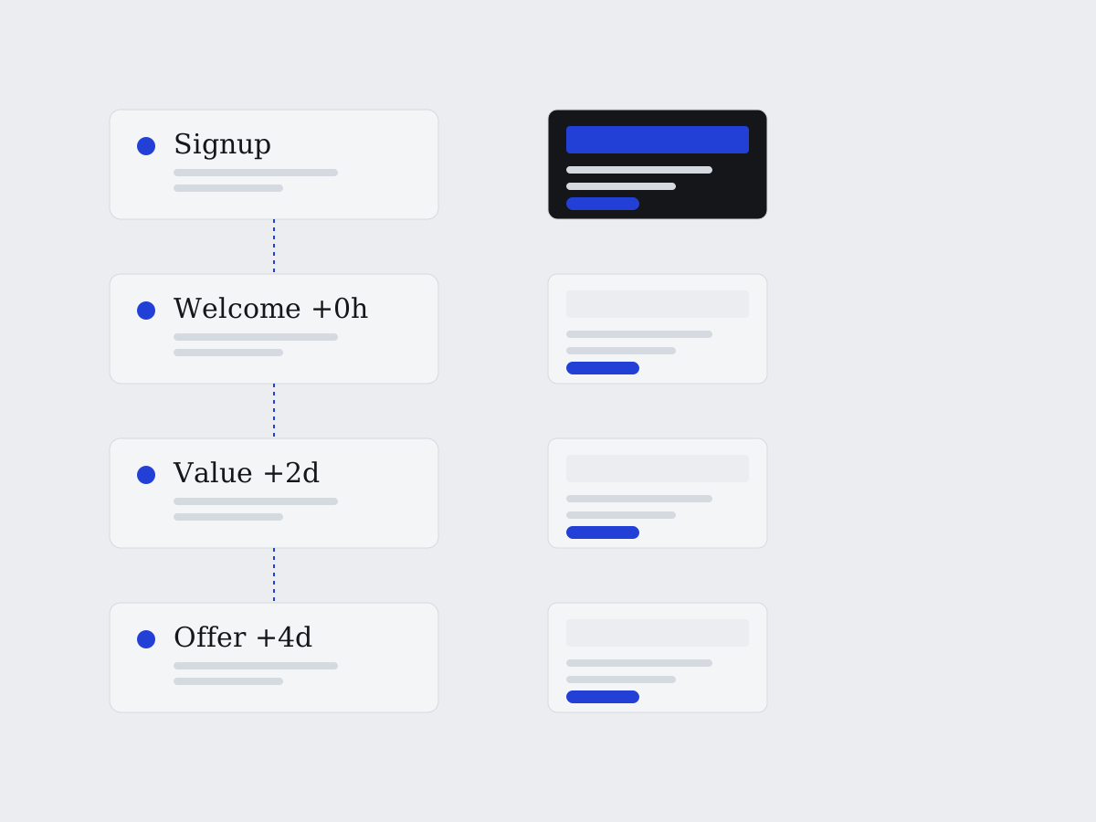
I started with the journey, not the design. I mapped a four-email sequence where each send had exactly one job — so the discount didn't have to carry the whole flow. Only once the logic was agreed did I move into Figma to design a reusable set of modules the whole sequence could be built from.
Signup → Welcome (+0h) → Why us (+2d) → First-order offer (+4d). Each step earns the next.
The choices that mattered
One job per email
Splitting welcome, brand story and offer across three moments let each be designed properly — and gave the flow room to build desire before asking for the sale.
Discount held to email three
Moving the offer to day four meant new subscribers met the brand and products first. The discount became a nudge, not the whole reason to open.
Mobile-first module system
A single-column, thumb-friendly layout with the CTA always above the fold. Built once as reusable modules so future flows stayed consistent and fast to ship.
Brand-led, not template-led
Editorial type, generous space and real product photography — the emails looked like the brand's best work, not a generic promo.
What changed
Anonymised, and framed honestly — the direction of travel matters more than any single figure.
What I'd push further
Next time I'd build in proper A/B testing from day one — subject lines and offer timing especially — so the improvements were provable, not just visible. I'd also branch the flow by signup source, since someone who joined from a product page wants something different from someone who joined from a competition.